I chose to use a Florence and the Machine song for my music video, Never Let Me Go. There are four main types of music video in which artists can work with, performance, abstract, narrative and animated for my chosen brief I decided to use the abstract type of video as the song I had chosen had lyrics which would have worked well with this chosen type. With also a hint of performance and narrative where my artist would sing to the camera and also do some movements where the camera had to track her. I wanted to use elements from Ellie Goulding - Your Song and Lana Del Rey - Born to Die as in the video they use both narrative and performance. For my music video I planned for it to include mainly narrative which would include a couple who were having problems that ended with the demise of the woman, and also to include some performance where my artist would sing the chorus towards the camera conveying the emotions she was feeling helping to build the narrative. However I also wanted some elements of abstract shots for my video.
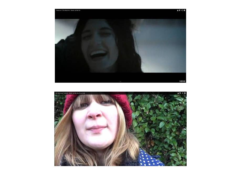
To find out the codes and conventions of real media products I analysed the official music video to my chosen song and I also looked at other music video's from that album to see what their reoccurring themes and conventions were so that I could get some ideas and inspiration for my video. When looking at the videos I found that the majority of them had a narrative which consisted of a girl and boy in love, in the Never Let Me Go video the main point and idea they wanted to convey was the idea of loss or lost love. I decided, when planning my video, that I would take this idea and use it within mine as I has already had a similar idea beforehand and that it would make it easier for me to build a story to the song as it had particular lyrics I could use visual imagery. However when it came to filming and editing I found that I hadn't thought and planned the narrative side of the video very well and it didn't convey the right message when watched by an audience.
When researching the codes and conventions of my chosen genre I found that the two types of form of music video where narrative along side performance so this was something I was able to use fully as it was a correct convention. Cinematography is a big part of convention in indie pop/rock as this is were the close up shots are, the use of close ups in the video is so that the sole focus is on the artist and no one else, long shots are also common as they're used to show the artists body language so they can convey their emotions to the audiences through acting and hand/body gestures. I used this in my video as whenever I used a close up it was whenever the lyrics were personal or self reflexive.

The mise-en-scene is also important especially in Florence and the Machine videos as they're usually in more abstract areas. For my video I wanted to include a natural and earth like theme were the video would include greens, blues and browns. With the lyrics in the song being about sea and the ocean I thought I'd take the idea and use it alongside the natural elements idea. The cuts also in indie pop music videos are slow and usually fade into the next shot of the artist, I found this easy to work with as my chosen song has a slow pace song where I was able to slow some shots down for a better effect. Having slow pace shots and cuts makes the video more passive so it's easier for the audience to relate to it and also reinforce the natural idea I wanted. I shot in a variety of different places which ranges from Hessel Foreshore to my own home, the area which I live has a great amount of greenery so I used this to my advantage and also my back garden has a low tree which I chose to film across to add to the natural/earth theme. In the Rabbit Heart video the main setting is surrounded by trees, which include some shots which are familiar with mine.


The use of close up with both artists whilst singing is a common convention for indie pop as the audience are able to see the star easily and also for artist to form a bond between them both and also the use of performance here by both artists.
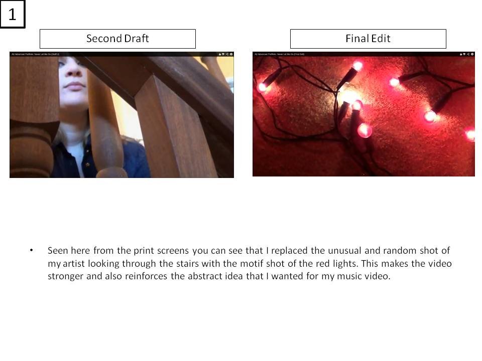
I didn't want my music video to be what some are considered 'walking videos' so I added in the abstract shots so that my audience would see it in a different light. Using the abstract shots I was afraid that they would be considered random so I chose them wisely so that they would have meaning and include ideas which I couldn't convey in any other way. An example would be the wood entwined love heart which I used to in force the idea that her love is complicated and also branches out and never ending and is strong and would never break. I used the red lights which also became a motif along with the wooden love heart as they represent the passion and affection she holds within herself. When editing these shots together I chose to put them alongside each other so that they would together make the message I wanted to convey strong and also noticeable.
Question 2 - How effective is the combination of your main product and ancillary texts?
I'd say, without reference to audience feedback, that the combination of the two is quite effective as both texts are strong on their own. After doing more research for the ancillary texts than the music video I'd say they are stronger as I took inspiration from a variety of different album covers and magazine adverts not just album adverts but others such as tour dates and took different aspects of them and integrated them together to create my digipak. I used Adobe Photoshop CS5 software when I was creating my digipak, I took a variety of different images which I would use for my ancillary texts, I wasn't sure what message I wanted to convey to my audience so I took around 100 images and picked out those which I thought were the strongest. I knew when creating my digipak that I wanted it to have a black and white theme which ran throughout it, as I wanted this to convey the message and also represent the idea of life and death. So I used the adjustments option and chose the black and white effect to change my images to create the theme I wanted.


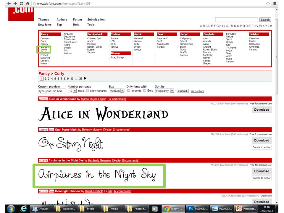
 When creating my digipak I first created album covers which I could use within my digipak, I chose the medium shot of my artist creating a pose which looks straight into the camera and also the audience grabbing their attention. The original photo didn't have the correct look which I wanted so I started using different effects which I could use, I came across an effect called threshold which turns the image black and white and also gives you an option as to how light or how dark you wish to create the image, this can be seen in my CD drafts. When choosing the font I went onto dafont.com and used the airplanes in the night sky font as it fitted in well with my genre and also the natural elements theme taken from my music video. I chose the colour black to keep in with my black and white theme, with the font being curly it then became a motif itself as within my digipak, advert and music video I have included elements which are curly such as the font, the wooden love heart, the tree and also the red lights. I wanted this idea to be conveyed so that her love in never ending and can grow into whatever shape or direction it needs to, as it is unconditional.
For the other spaces on the digipak template I tried using different images of my artist but I couldn't find the ones which worked well together. It didn't convey the idea I wanted to put across and also the digipak didn't look professional and also didn't fit in with my chosen genre. From the research I did my digipak didn't look like one which could be sold within a record shop. When printed off and put together like a digipak I found that it wasn't what one would conventionally call a digipak, so I removed the images a put in black and white polka dot images on as a way to create the genre within my digipak. Also on my first draft of my digipak on the track listing there wasn't the conventional aspects such as the bar code, record company logos and the 'ALL RIGHTS RESERVED' so when creating my second draft I put the correct and important information in so that I would not just get more marks but also that it will look more like a conventional and professional digipak.
 I wanted to carry on the theme of natural elements I used in my music video within my digipak to keep the continuity between all my media texts and for it to also look like a professional digipak which could be sold in shops and also online, so I used the screenshots from my music video of the trees and also of the wooden love heart and the image of the couple walking on Hessle Foreshore, this is so that the motif and the ideology of my media texts would be conveyed of undying love. I used the black and white option to be sure I didn't break the continuity, I also included the realism aspect of my video by having photos of both the front and back of my artist standing to show that she is in fact alone in all way which I chose to included in my final digipak. Because this is the template of my digipak I had to use the rotate option for me to be able to have it upside down, for when I print it off and put it together it will be the correct way round. Shared elements between the three texts are mainly spotted through the use of mise-en-scene as the Russian style fur hat my artist is seen wearing in the magazine advert is also worn in the digipak and in some shots in the music video, this is a reoccurring element.
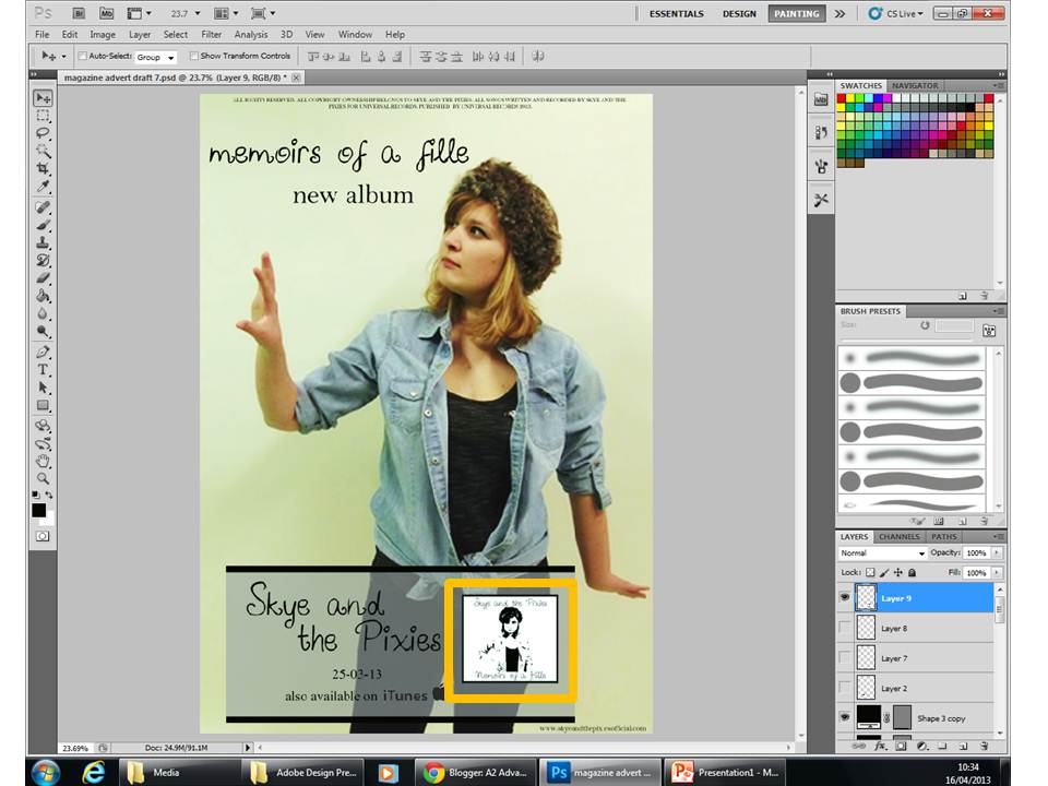
On my magazine advert I wanted it be simple but for it to also stand out and be noticed, I chose to use a simple full photo of my artist which shows her from head to toe, I made the decision for her to be wearing the same clothes as she's seen to be wearing on the digipak for the reasons for continuity but also so the audience will see that they are part of the same advertisement. The photo I chose looked dull and bland so I changed the brightness and also the vibrance so that the image has a soft glow to it which is conventional for indie pop adverts.
Before -
After -

I chose to include both my artists name and the album name on my advert so that my audience will know the necessary information but also because those where the conventional aspects needed for a magazine advert. Because of the way my artist is stood it proved difficult for me to put text onto the image as there were awkward spaces which needed to be filled. When deciding on the text and where to put it I changed the font style which I had used previously on my digipak and decided to put my artists name on the top with the album on the bottom. However this broke the continuity between both media texts so I changed the font back to the original but when I asked for feedback on the draft most people got the artist and album name mixed up, so as a way to overcome this problem I swapped the texts around which made my advert clear and also look appealing for my target audience (drafts). After having the basics of my advert I then decided to add the add on's which help make the advert more professional, I decided to add the conventional date of release and also an image of the album cover itself so my audience is aware of what it looks like for when/if they choose to buy it. I created a website for which my audience will be able to go onto if they wish to find out anymore information on my artist or my album, and also to include the iTunes option where my audience is able to go on from the comfort of their home and buy it instantly from the iTunes store.

I chose not to include star ratings as in my opinion I felt it didn't work with the style I wanted to achieve; it made the advert look too busy and disregarded my idea of having it simple. I wanted to have a clean and blank background so it didn't take away attention from the artist and the text.
Question 3 - What have you learned from your audience feedback?
After receiving feedback from both video and questionnaire I found that when asked if it fitted with the indie rock/pop genre they all agreed that it was more pop than rock based which I agree with as it's more of a pop song. When asked to rate my video in terms of abstract I got relatively the same number from every person I asked and also when I asked about what genre they think my video fits into some said indie pop because of the clothing my artist was wearing including the hats which are quite indie themselves. They also said that through the use of mise-en-scene they could tell what they genre was from the chosen locations and also the representations of how my artist is feeling through the shots and also lyrics. When I asked about my ancillary texts they all agreed that they fitted in with the genre and followed continuity. They said that the costumes my artist was wearing was typical indie and the pose she uses and her facial expression represent the indie side to her which may not have been noticed in the music video. They also agreed that the theme continues to run throughout the media texts and also that they follow the conventions of a magazine advert and digipak because of the little details such as the 'ALL RIGHTS RESERVED' and 'ALSO AVAILABLE ON'.
When asked what could be improved on my music video the majority of the people said to add a/or more narrative so that there would be more to look for within the video. They also explained that adding a narrative would make the video more interesting and also to add different shots for a variety so that they wont be so much repetition with the shots. On my first draft the most common improvement I got told was to re shoot most of the shots to make it look more professional and less amateur, and also to use more of the abstract shots which in the end was received pretty well and the majority of people liked the idea.
Taking my online poll into account I found that 81% of the people who voted were females, 100% of them were ages 17-19 and 81% said their favourite genre was indie. When taking my audience into account I found that it all fitted perfectly with what I wanted as a target audience and what they expected from my video. From my poll they majority, 90%, watch music videos online via YouTube which is what I intended my audience to be in contact with. Having my target audience based around 17-19 years I found this is to perfect as they are around the same age as me so I was then able to create something which they could enjoy and watch on different media technologies.
Digital Feedback
Questionnaire Feedback


Question 4 - How did you use new media technologies in the construction and research, planning and evaluation stages?
 The first thing I used when starting the project was create a blog on blogger.com and name it A2 Advanced Portfolio which I would then use to store and keep all my work of production and final pieces in a neat and easy access area. I then used the website called YouTube to listen to different song choices as this website is helpful in giving suggestions of different and also similar songs and also is the area in which I can keep my edits of my video, and the place where my audience is able to watch it whenever they feel like. I created an account, EllieWalker95, which is where I uploaded my videos onto.
 After creating my different accounts I started research on the codes and conventions of a music video in which I used a prezi slide show to present my findings in a different and refreshing way, from this I was able to present the different aspects of the codes and conventions in which is difficult in an essay form. When planning my music video I used Windows Live Movie Maker to create my animatic, I scanned in my finished storyboard and cropped each shot individually so that when put together with the music on the time line it would look like a music video. The reason for creating the animatic was a way of showing me and others how my music video would look with the real timings so it gave me a chance to edit them if they were too short or too long. I created a goanimate to put together the feedback which I received from my first draft, from this I was able to take the feedback and adapt it to my second draft. It included the idea to make my video more abstract which interlinks with the natural elements theme I had wanted to make.
To create my music video I used Adobe Premier Pro CS6 which I used to upload all my of my raw footage so that I was able to see what I had and then start to edit. So I knew which shots were which I names them all by the shot number from my storyboard which helped me to quickly find the correct shot I needed. Having used this program before hand I was able to start editing right away which no help from the technician However I did have problems with the lip syncing which I then asked about. Using this software and having previous knowledge and use beforehand I was able to use all the effects and options available to me, which ranged from changing the speed of the clip, the duration and also the transitions which was a big part of my video. I used a Sony HD digital camera to record all my footage which I had shot, I chose to use this camera as it was practical when it came to shooting and also I had used one before so was familiar in the way it worked so I felt more comfortable using this camera than any other. With it being a digital camera I was able to save all my footage onto a memory card which I could then transfer easily onto any editing suite I wanted.
I used a OLYMPUS SP-600 UZ still camera to take the photos for my ancillary texts, this type of camera had excellent quality which helped to, when at my photo shoot, make my photos look professional and also clear. I then used Adobe Photoshop CS5 software to create my ancillary texts, having already used this program at secondary school and also my AS coursework I had full knowledge of how the system worked and all the tools and options I could use. By having this knowledge I was able to create professional looking media texts as it enabled me to have any text and font and also with the option of layering I could include and create anything I wanted, which helped to create conventional digipaks and magazine adverts. When collecting my audience feedback I used my Blackberry Curve 9300 3G phone to record me asking people questions and them replying with their responses, using this was easier and quicker than using the Sony digital camera as I was able to just copy and paste the video into my desktop and upload them onto YouTube. It is a good quality phone so the image and sound were clear so the videos were okay to watch and understand.
Overall, I feel from the audience feedback that I created a music video which fits with my genre however doesn't have any narrative which I had wanted to have. But apart from that I believe I have created media texts which appeals to my target audience, I feel that I managed my time correctly and found the process to create both my video and texts easy however I did come across some parts which stopped me from progressing with my project, but I did eventually overcome them. If I were to do this project again I would make sure to include a narrative into my video and to also make it clear that there is one, as this was the only error and improvement my audience gave me.
Word count - 3670
Final Edit
Final Digipak and Magazine Advert